Ojos Project: Iris
Creating an accessible and intuitive software system to improve palliative care for patients, families, and caregivers
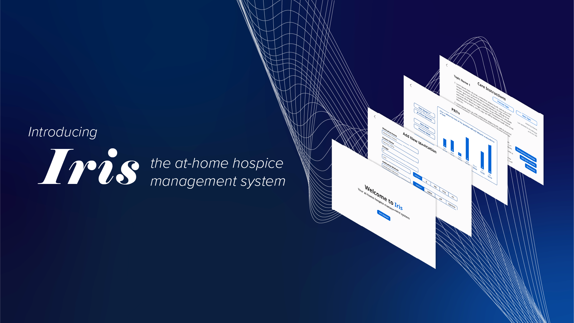
Overview
The Problem at Hand
There is a lack of easily accessible software systems dedicated to connecting palliative care patients, their families, and their care providers. The Ojos Project is seeking to improve the palliative care experience for all parties through two main projects: Iris and Palliaview. Iris is an open-source hospice management software system, and Palliaview is a hospice monitoring device designed to run Iris.
I joined the Ojos Project as part of the Iris team in April 2024. While I originally divided my time between UI/UX design and implementing those designs into the frontend using Next.js, the frontend development team later gained more members, and I was able to be a dedicated UI/UX designer for the team.
Communication With Researchers
Members of the research team reviewed papers and conducted interviews with people involved in palliative care to determine which features Iris should include. Their findings were distilled to me through a requirements document, GitHub issues, and direct discussions with me.
Features I created UI designs for include user onboarding, medication logging, a collection of useful resources, customizable care instructions for patients, storing contacts, video calling, system settings, and patient-reported outcomes surveys.

Reviewing the requirements for features and discussing ideas for features were always the first steps in my design process for each feature.
Low-Fidelity Wireframes

After reviewing the requirements for features, I created low-fidelity UI wireframes using Figma. These allow me to quickly plan out the general layout of the pages and the user flow of features. When designing the planned interactions and flows of features, intuitiveness is a high priority, especially in a healthcare system such as Iris. For example, buttons are highly visible and clearly indicate what their functions are.
Visually seeing an idea is always better than simply trying to mentally picture it when making design decisions, so this stage allows me to test out different ideas and receive input from other members of the team early on (when changes are easiest to make).
Style Guide

A consistent style throughout a piece of software makes the system feel cohesive, so before I designed higher-fidelity wireframes, I created a style guide for the software that defined the primary colors and fonts that should be used when creating designs for Iris.
Iris is intended to be used by a wide variety of people ranging from patients, loved ones, and healthcare professionals. Therefore, accessibility was the highest priority when creating the Iris style guide. For example, all text and background color combinations had to at least satisfy the contrast ratio requirement for WCAG 2.2's Level AA criteria (and most of the combinations satisfy the Level AAA criteria for contrast). Additionally, I chose to use Noto Sans throughout the system as the font is easy-to-read and considered accessible. Noto Sans also has support for multiple languages, which will make it easier for Iris to add additional languages to the system in the future.
Higher-Fidelity Wireframes & Interactive Prototypes

Building off of the low-fidelity wireframes, I used Figma to create reusable components and higher-fidelity wireframes that incorporated the styles laid out in the style guide. I also used the guide features to maintain consistent margins throughout the designs.

I then utilized Figma's prototyping features to add interactions to the pages to give the developers a better idea of how the software is planned to behave.
Design Iterations

I also received feedback on my higher-fidelity designs from other members of the team and through user testing conducted by our researchers. Taking the feedback in consideration, I created more iterations of my designs and received feedback on them, further refining my designs.
Icon Designs

One of the features in Iris is to log the medications taken by a patient. The different types of medications that a patient takes are stored by Iris. To help users differentiate the medications saved in the system, I used Adobe Illustrator to create icons to represent pills/tablets and injectable medications with different background colors.
Article Banners

The Ojos Project's website has a news page, and articles have banners attached to them. Previously, all of the articles reused the same banner of the Ojos Project's logo, so during my last couple of months as part of the team, I volunteered to design banners for articles using Adobe Illustrator to help differentiate the articles from each other.
Key Takeaways
Since high contrasting colors was a high priority for text colors and key interface components, I learned that finding suitably high contrast color combinations that are aesthetically pleasing alongside the rest of the color scheme can be time consuming. However, this additional time is definitely worth it as the system becomes more accessible as a result.
The usefulness of having a general understanding of programming as a designer was also made quite apparent to me during this experience as I communicated with developers extremely often. For example, when planning the feature of how a user adds a medication to Iris' storage, I was able to have discussions with the developers on how the UI should look like and how the database schema should be structured.